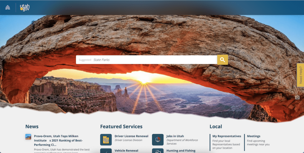
The government! It’s big, it’s scary, and sometimes it can’t help being a silly goose. For example, the people who make government websites seem to be receiving wildly different instructions based on what state they’re in. Just look at the difference between ny.gov and utah.gov.
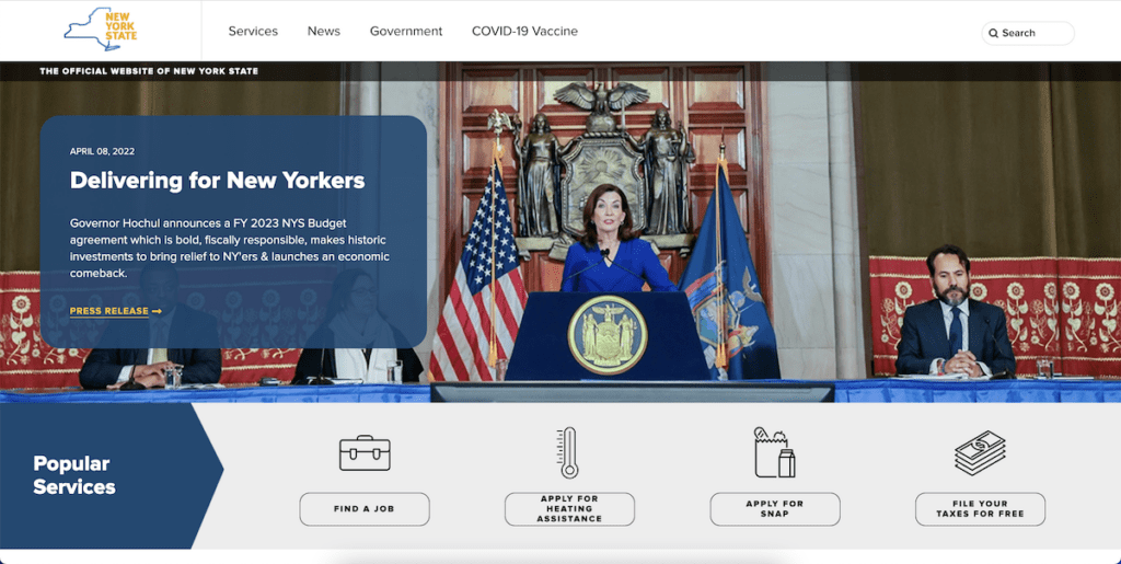
Utah’s main page invokes a feeling of civic pride with easy-to-find links that make the rest of the website easily accessible, organized, and nice to look at. New York’s main page is like if you could play Mad Libs with pictures. Neither website is bad, but Utah’s is a lot less busy and, I would argue, much more streamlined.
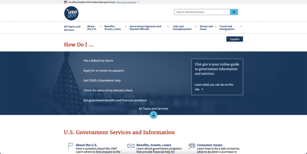
And then there’s good ole usa.gov, a prime example of a good main page. It’s similar to that of Utah’s main page in that it’s easy to look at the list of services.
Heck, I’ll even admit that New York’s main page, while busy, has easy-to-follow links right on there in front of you. The problem is when you go…to the depths of the websites. It’s here where tedium meets frustration as you try to parse all the information on all the laws you didn’t even know existed. You could drown in the amount of information and bad design trying to answer a simple question from a government website.
Let’s look at ny.gov again. Specifically at the hunting regulations page.
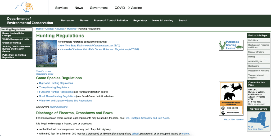
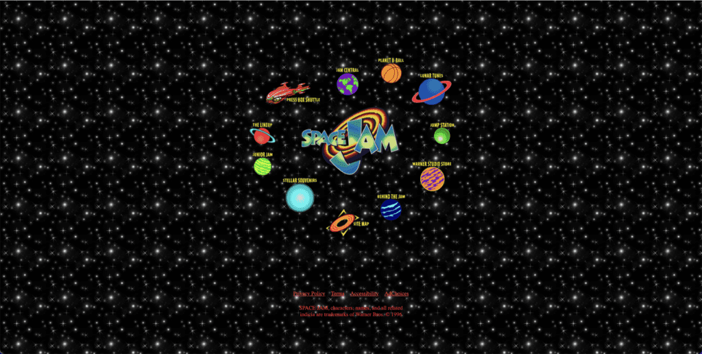
Sure, it’s not as attractive as the main page. It’s not even as attractive as the Space Jam website which hasn’t changed since 1996. But it does have a ton of information!
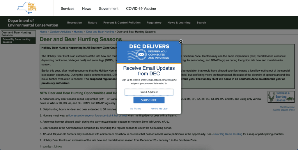
Hey let’s take a look at all the current hunting seasons. Ew, a pop-up. Let’s get rid of it. Oh this has brought me to a list of all the different hunting species for different animals. Well let’s click the future big game hunting season link. Ew, a pop-up. Let’s get rid of it. There we go! Now I know that early bear hunting season happens on the first Saturday after the second Monday in September, but only in the Northernzone. Wait, there are different zones? Where does one zone’s jurisdiction start and end? Better click on the link for Deer and Bear Hunting seasons for helpful maps and tables. Ew, a pop-up. Let’s get rid of it.
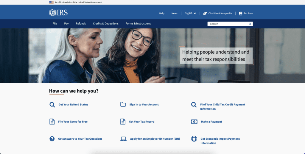
The website goes on like this. Forever, potentially. Each page links to another page in an endless cycle that will keep you clicking for information until the eventual heat death of the universe. And it’s not just New York’s website that does this. Every state website is a test of will. If you seek information of any kind from a state website, it’s tedious at best and impossible at worst. And don’t even get me started on the federal government websites. Have you seen the website for the IRS? The main page looks nice and organized, but this is another trick. The user interface of this website, the DMV, and more seem to be complicated on purpose, with forms that you can’t e-file, descriptions that leave you more confused than when you started, and a level of apathy that just seems cruel.
So why are they so bad? Because this isn’t just happening in our collective imaginations. A study from the Information Technology and Innovation Foundation found that 92% of government websites are either slow, insecure, not mobile-friendly, not user friendly, or a combination of these bad things. For example, the IRS website failed an accessibility test for users with a disability, while the Department of Defense website showed significant failures in security-related tests. Call me old-fashioned, but the Department of Defense website is the one place on the internet that should be the most secure.
These massive failures in security and accessibility are apparently nothing new. Most government website interfaces were made well over a decade ago and have intricate systems that are difficult to make major changes too. That said, even if the changes were easy to make, the government doesn’t seem to see a real incentive to change anything. There’s a lack of competition when it comes to government web services. It’s not like the DMV or IRS has a rival to compete with, so there’s a level of complacency since people are forced to give the website traffic.
This complacency is not just annoying, but it has the potential to be dangerous. Remember in 2015 when the Office of Personnel Management got hacked? It put 22.1 million people’s personal information at risk. Fortunately, the government launched a 30-day campaign to secure these people’s information. Experts say that similar action should be taken on a regular basis to increase cybersecurity since the next attack is not a matter of if, but when. Let’s be honest, there are some talented little demons on Reddit that could mess things up for us if they wanted to.
The good news is that some states have finally realized their websites feel like a drill going into your brain. Arkansas has launched a digital government assistant in 2017 and other states, like New York, are very open to listening to constituents, even making major changes to their website’s main page a few years back. The pandemic assistant page left something to be desired, but I’m willing to cut them some slack since it was thrown together during an emergency.
Whether you love it or hate it, the government does a decent amount for its people. It’s good at a lot of things, but web design and security are not their strong suits by any measure. They need to be better about listening to the public’s concerns and learning from their past web disasters. They need to plan ahead for the next attack instead of waiting to deal with the aftermath of an angry middle schooler who got bored with playing Fortnite. Also, would it kill them to have less confusing links on state and federal websites? Let’s just consolidate a lot of information we dedicate an entire page to. Until then, good luck navigating your state’s website. Godspeed.
Russell is a writer and comic based in New York City. His plays have been featured at Penn State’s Cultural Conversation’s Festival, The NYC Thespis Festival, and Imaginarium’s Inaugural Theater Festival. Follow him on TikTok and Instagram @pooleparty528


